The harmony of space is determined not by decorative elements, but by the precise ratios of architecture, furniture, and interior details. Antonovych Design studio applies strict principles of proportion and scaling to create a visually cohesive space that is comfortable and aesthetically refined. Creative designer and international award winner Svetlana Antonovich shares her methodology for working with proportions and scale in premium projects and clearly demonstrates their practical application.
Proportion as a Structural Tool
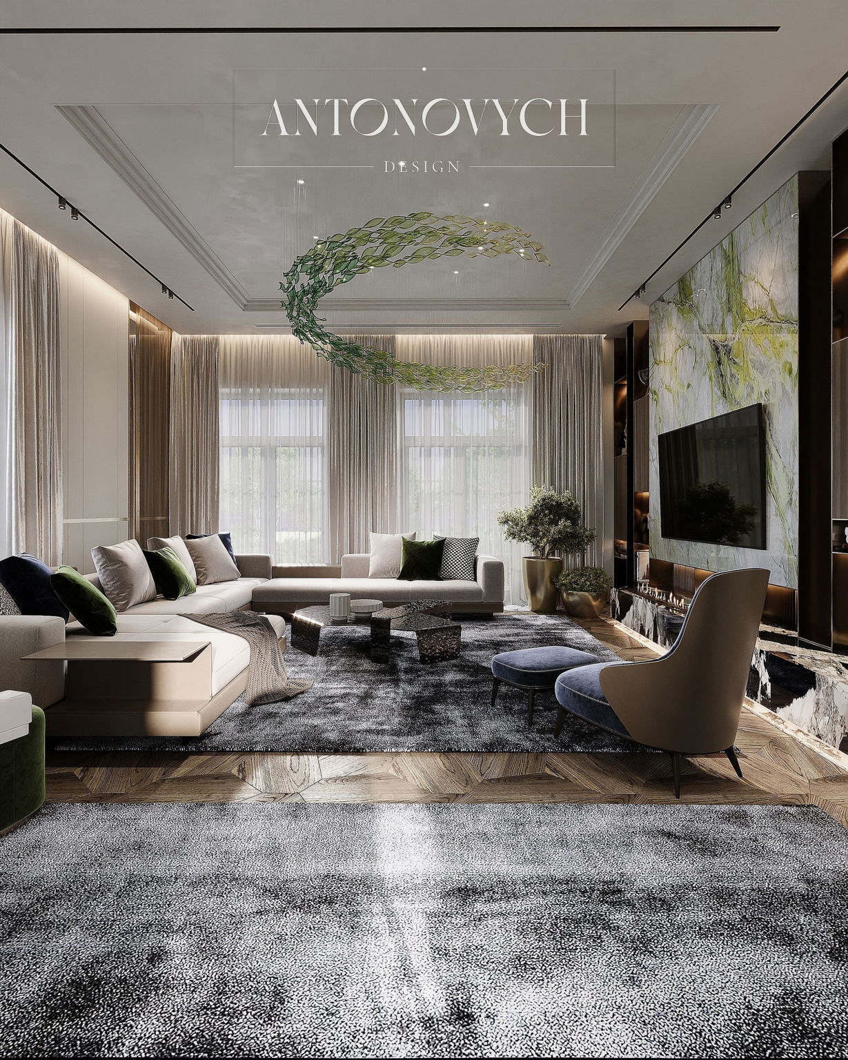
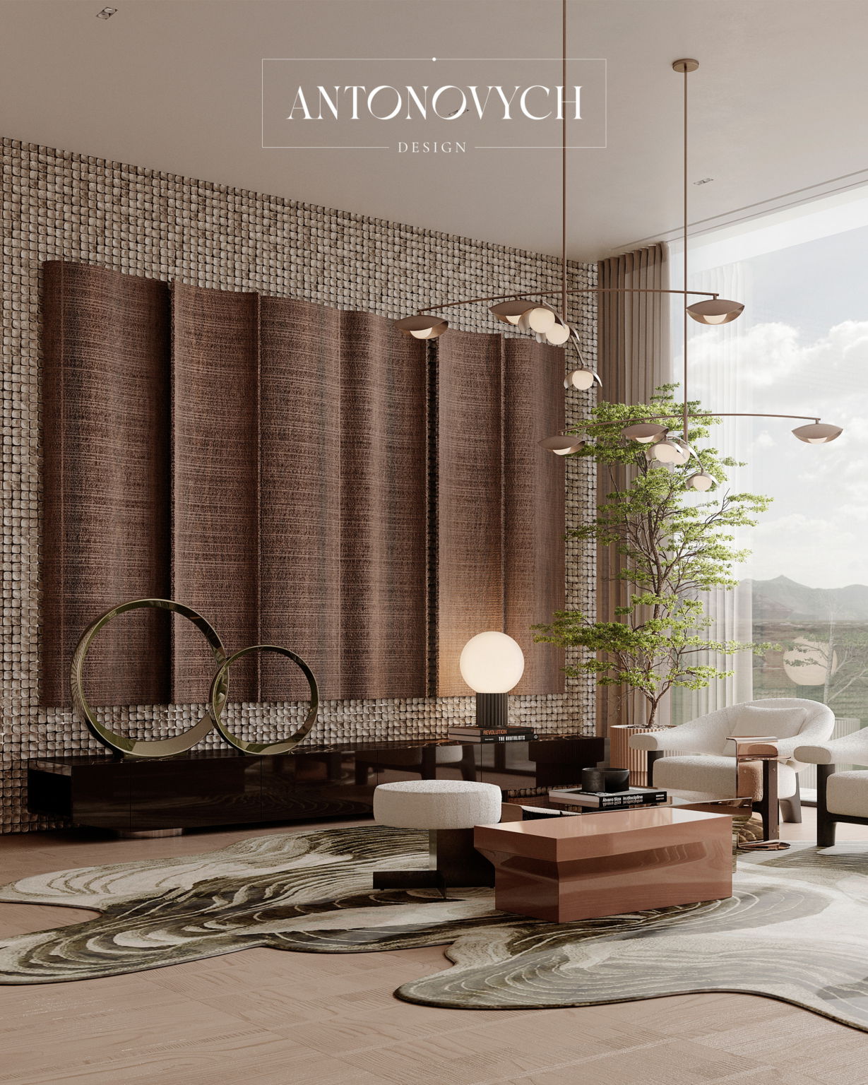
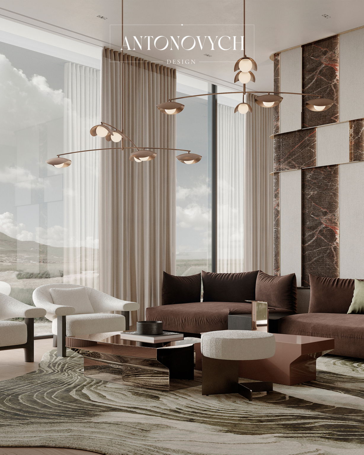
Proportions define visual and functional balance. The optimal ratio of ceiling height to sofa group length is approximately 1:0.7–0.8. Svetlana Antonovich explains: “If the sofa group is too small relative to the ceilings, the space loses its sense of integrity; overly large furniture makes the interior feel oppressive.”
Scale and the Human Factor
The size of furniture and accessories is calculated taking into account passages and ergonomics. For example, for comfortable movement, it is optimal to leave a distance of 1.2–1.5 m between large pieces of furniture.
“Scale is chosen so that the space remains comfortable for movement, yet looks proportional and monumental,”notes Svetlana Antonovich.
Ratio of Architectural Elements
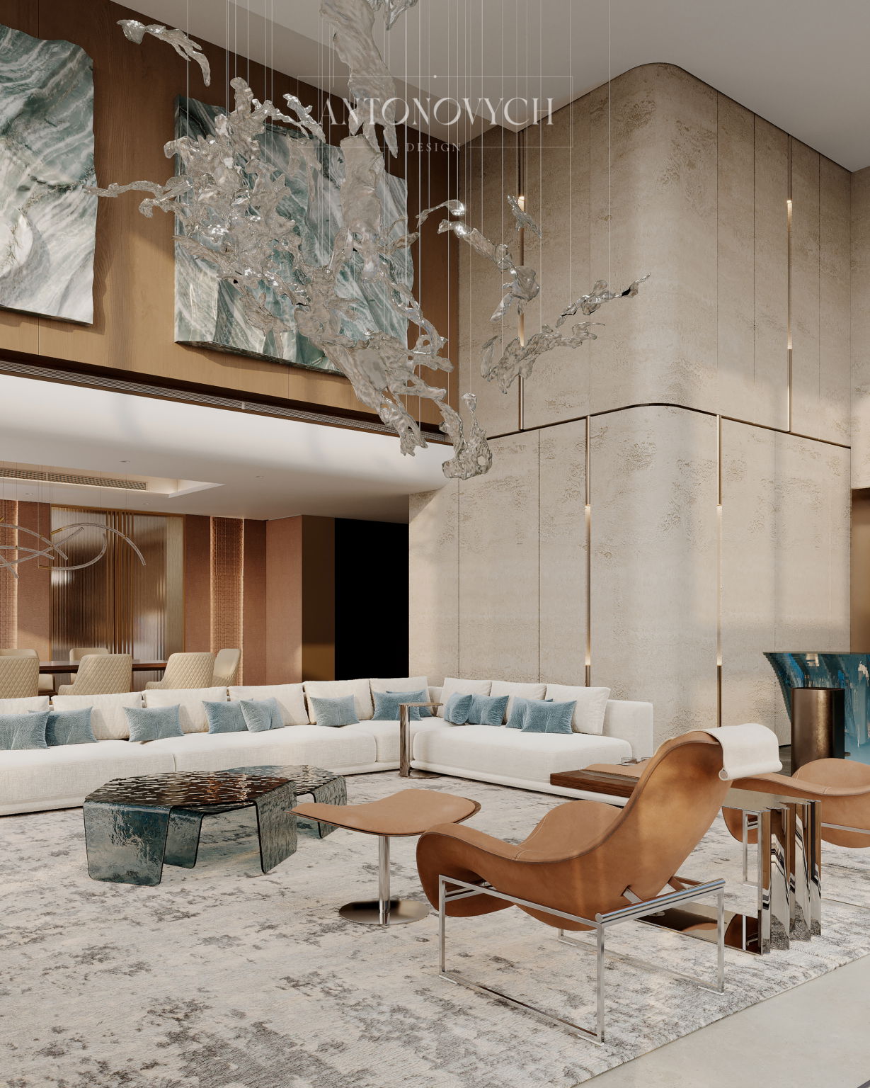
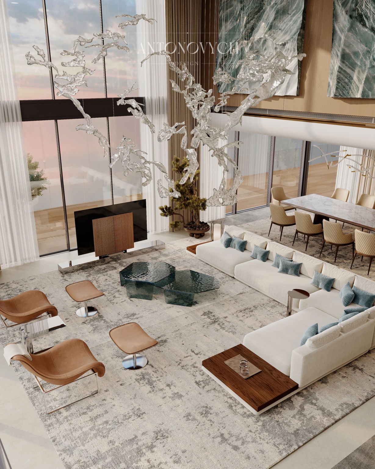
The height of windows, doorways, and columns should relate to the furniture. The optimal proportion of a large architectural element to furniture is 1:2–1:3. This ensures a natural visual balance: attention is held on key objects, while other elements support the composition.
Lines and Geometry
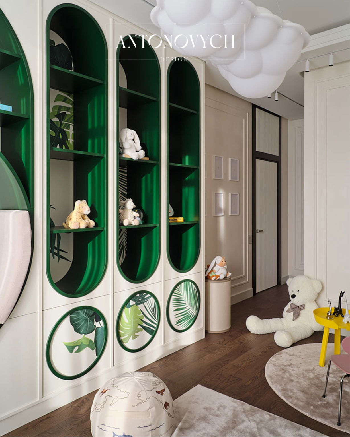
Vertical and horizontal lines create the rhythm of the interior. For example, the combination of vertical cabinets and horizontal shelves is recommended to maintain a width ratio of 1:2–1:3.
“Such combinations help guide the eye and structure the space without overloading it with visual accents,”explains Svetlana Antonovich.
Functional Proportion
Ergonomics is closely linked to visual harmony. The optimal sofa depth is 90–110 cm, countertop height is 75 cm, and the passage width between the dining table and island is 1.2–1.5 m. These guidelines allow combining comfort of movement with a proportional perception of space.
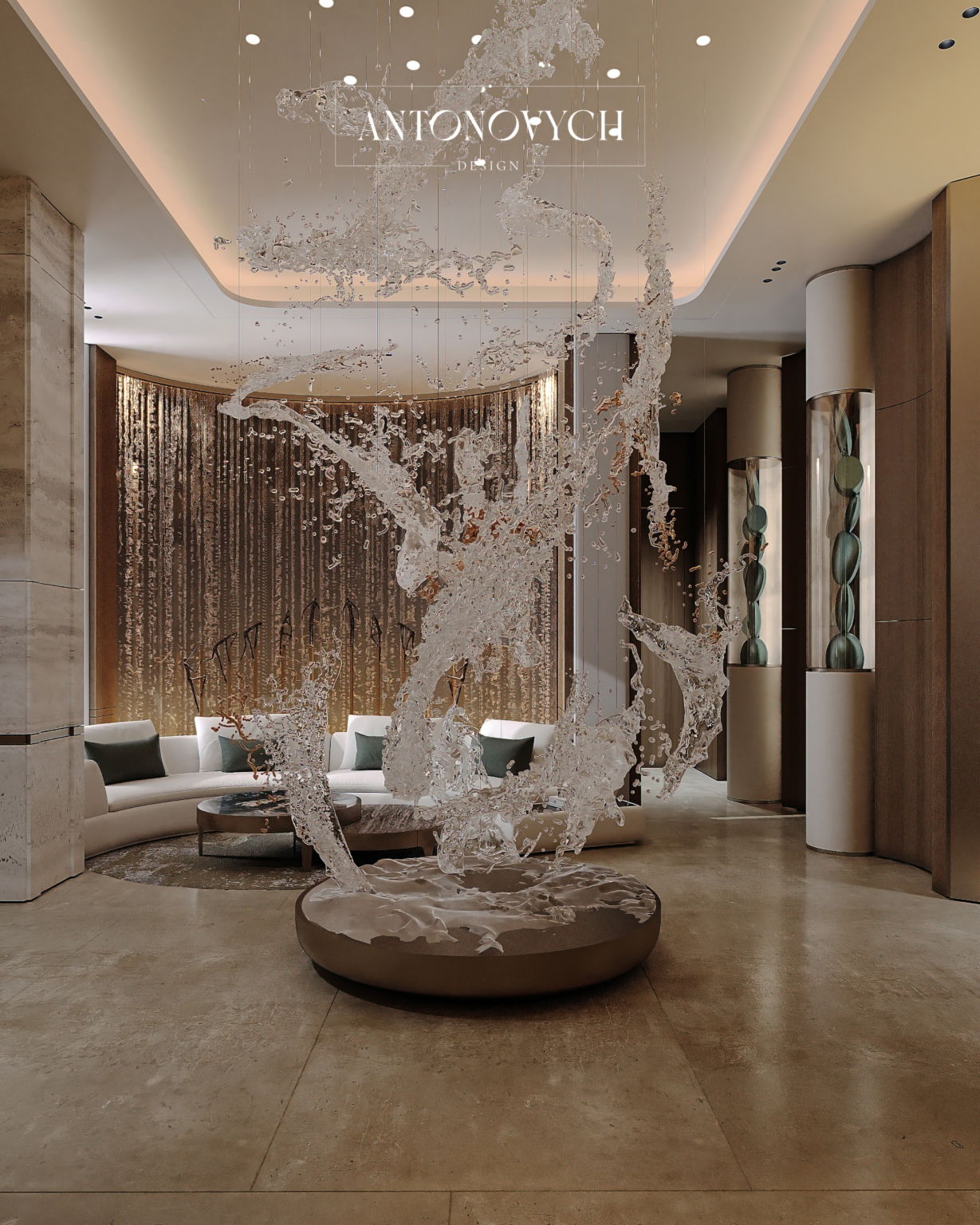
Visual Accents and Focal Objects
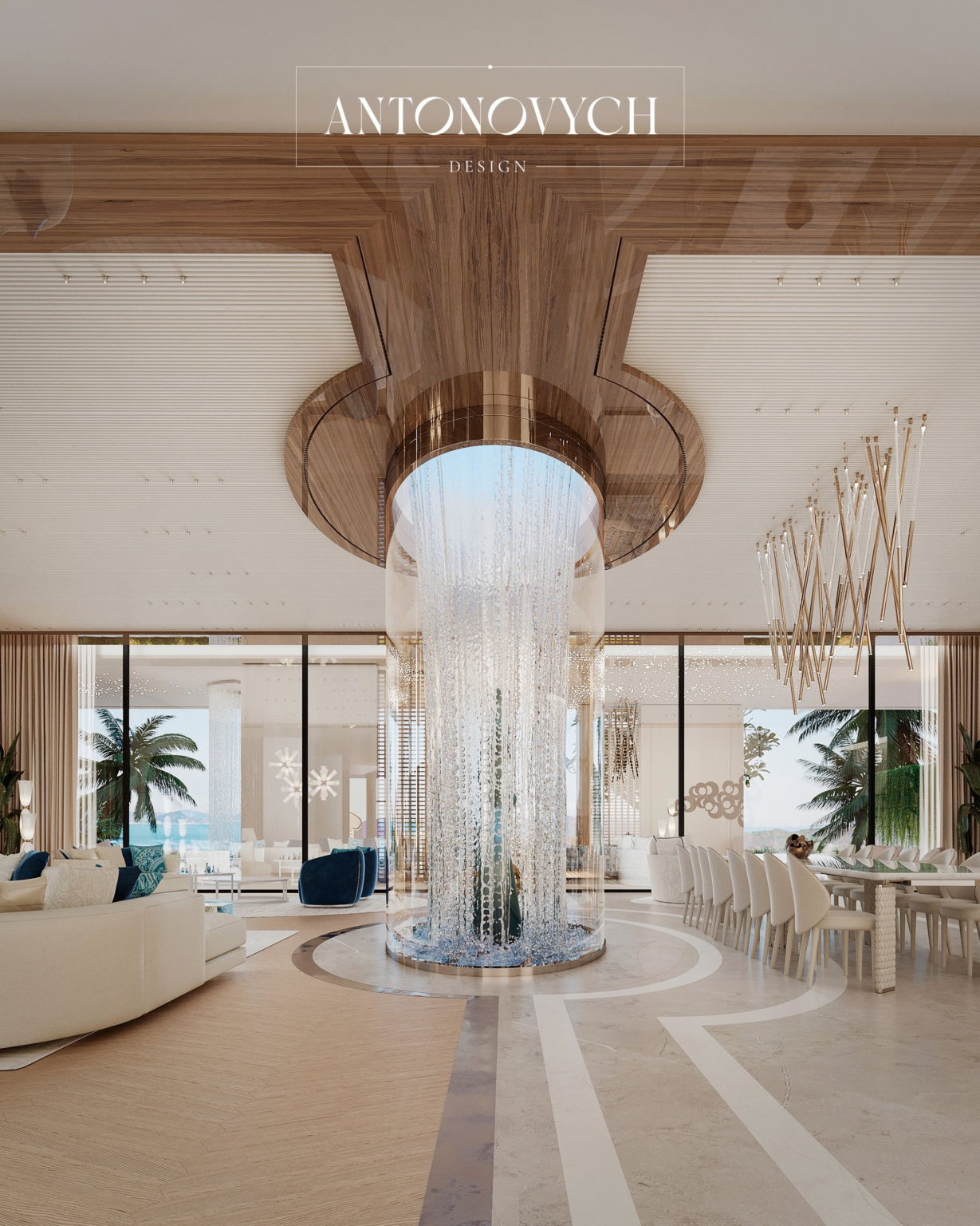
Large items, such as chandeliers or sculptures, become anchors of the composition. The optimal diameter of a chandelier in a living room with a 3–3.5 m ceiling is 1.2–1.8 m. “An accent object forms the center of attention, around which the entire interior is built,”notes the designer.
Repetition and Rhythm
Repeating forms and sizes creates consistency and visual order. For example, geometric motifs on walls or repeating furniture elements are recommended to be spaced 30–60 cm apart to form a structured rhythm without overloading the space.
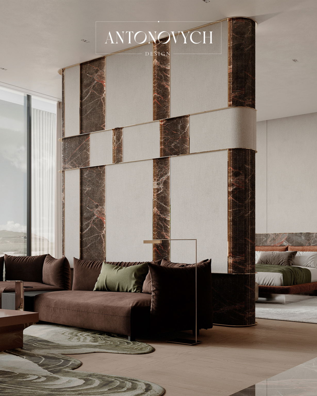
Contrast as a Tool for Fine-Tuning Perception
The contrast of large and small objects, light and dark surfaces enhances expressiveness. Example: a large dark sofa against a light floor and walls with precise proportions emphasizes the seating area and maintains visual balance. Contrast should be maintained in a ratio of approximately 1:2–1:3 by area to avoid disrupting harmony.
Proportions and scale are tools for architectural analysis and design, defining the visual structure, ergonomics, and perception of the interior. Svetlana Antonovich emphasizes: “Understanding proportions and their precise practical implementation distinguishes a premium project from a simple decorative composition.”The application of formulas and guidelines for height, depth, width, and element ratios allows Antonovych Design to create interiors that are organic, functional, and visually expressive.